

Responsive Navbar with Bootstrap
Responsive Navbar with Bootstrap
Introduction:
Bootstrap has a very interesting feature of providing a navbar from its prebuilt CSS and JS features. This navbar comes with a variety of choices of features. This is really feasible for the coder to generate a nice responsive navbar with quite a few codes. Bootstrap makes the navbar not only responsive but also generates many options and features like drop-down, search, and many more, in it.
Pre-requisite:
Make sure that you have linked CDN of Bootstrap with its CSS and JavaScript files. It can also be done by installing Bootstrap through package managers or downloading the whole file then linking it to the document.
Features:
The .navbar class of Bootstrap provides different attributes. This generates a wrapping method to generate the navbar. It has different breaking points which can be mentioned according to the requirements. (-sm|-md|-lg|-xl)
The default property of the navbar is fluid which makes it generate the navbar full to the viewport width. This is very much responsive by nature and supports many sub-components, some of them are:
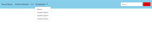
- Proving Nav-element: To list out the navbar elements the .nav-item is used. This will automatically display the text the coder wants to display as a navbar element.
- Active nav-element: .nav-item active is to be used when there is a need to show one or more navbar elements as active regardless of whether they are clicked or not.
- Branding area: It has an area where we can put the branding image or text in the navbar. This element should be inside .navbar-brand.
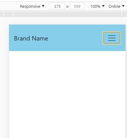
- Hamburger toggler: The .navbar-toggler class provides the coder to access a responsive hamburger toggle menu with a collapsible menu plugin.
- Drop Down Items: To generate a drop-down menu in the navbar there are 2 classes that are needed. The first one is .dropdown-menu under which the menu items to be declared and the second is .dropdown-item which is used to declare the items.
- Colors in Navbar: There are various set of classes in Bootstrap which can be used in the navbar to generate some colors such as .navbar-light for use with light background colors, or .navbar-dark for dark background colors. Then, customize with .bg- utilities.
Methods/Code:
<nav class="navbar navbar-expand-lg navbar-light " style="background-color: skyblue; height: 85px; font-size:1.3rem;">

      <a class="navbar-brand" href="#">Brand Name</a>

      <button

        class="navbar-toggler"

        type="button"

        data-toggle="collapse"

        data-target="#navbarSupportedContent"

        aria-controls="navbarSupportedContent"

        aria-expanded="false"

        aria-label="Toggle navigation">

        <span class="navbar-toggler-icon"></span>

      </button>
In the above code, the brand name and the condition for the hamburger toggle menu are written. This also has some inline styling. The navbar has a breakpoint of shrinking at -lg.
<div class="collapse navbar-collapse" id="navbarSupportedContent">

        <ul class="navbar-nav mr-auto">

          <li class="nav-item active">

            <a class="nav-link" href="#"

              >Active Element <span class="sr-only">(current)</span></a

            >

          </li>

          <li class="nav-item">

            <a class="nav-link" href="#">Link</a>

          </li>

          <li class="nav-item dropdown">

            <a

              class="nav-link dropdown-toggle"

              href="#"

              id="navbarDropdown"

              role="button"

              data-toggle="dropdown"

              aria-haspopup="true"

              aria-expanded="false"

            >

              Dropdown

            </a>

            <div class="dropdown-menu" aria-labelledby="navbarDropdown">

              <a class="dropdown-item" href="#">Option</a>

              <a class="dropdown-item" href="#">Another Option</a>

              <a class="dropdown-item" href="#">Another Option</a>

              <a class="dropdown-item" href="#">Another Option</a>

            </div>

          </li>

        </ul>

        <form class="form-inline my-2 my-lg-0">

          <input

            class="form-control mr-sm-2"

            type="search"

            placeholder="Search"

            aria-label="Search"

          />

          <button class="btn my-2 my-sm-0" type="submit" style="background-color: red;">

            Search

          </button>

        </form>

      </div>

    </nav>
In the above code, the navbar items are declared in which there is a dropdown menu section which is having dropdown items. These can be viewed once clicked in it. Along with this, a form inline section is mentioned along with a button. This can take input and fire a search event.
Output:
There is an active navbar item and the dropdown list is displayed.
The responsive version of the navbar.